
Tuist's website is where developers begin exploring the product, learning about its features, and discovering what Tuist is all about. We wanted to make this experience simple and welcoming, not just visually, but also in how the brand and content feel.
As Tuist evolved, the old website no longer represented what we’re building and shipping today. After redesigning our developer dashboard, we wanted our landing page to match its new look and feel. We began by reviewing what worked well on the previous site and what could be improved, drawing inspiration from other developer tools. We also realized some important information was missing, and with new features launching every cycle, it felt like the perfect time for a redesign.
The process
Before redesigning the website, we spent time researching what could be improved and what was missing. We reviewed over 25 developer tool websites, studying their strengths and weaknesses. The website plays a big role in shaping our brand identity, and with the dashboard redesign, we wanted to bring the same look and feel to our site.
The main issues we identified were:
- The old website didn’t clearly communicate that Tuist had grown beyond the CLI.
- The previous site layout made it hard to find information or understand Tuist’s features.
- It was difficult to showcase new features and updates effectively.
- We weren’t clearly demonstrating how Tuist supports real teams or inspire new contributors to get involved.
- The website visuals didn’t align with the newly redesigned dashboard.
Stage 1: Clarifying the Message
The first thing we noticed was that our story wasn’t being told the way we wanted. Tuist had grown far beyond being just a CLI tool, yet our website still gave that impression. We wanted to communicate what Tuist truly is today, a platform that helps teams build, collaborate, and ship mobile apps.
To do this, we reworked the content and page flow to focus on the bigger picture of Tuist’s ecosystem. We looked at developer tools like Vercel, Supabase, and Linear, understanding how they convey complex ideas in a clear, simple way. More on this topic below.
Stage 2: Improving the Structure and Navigation
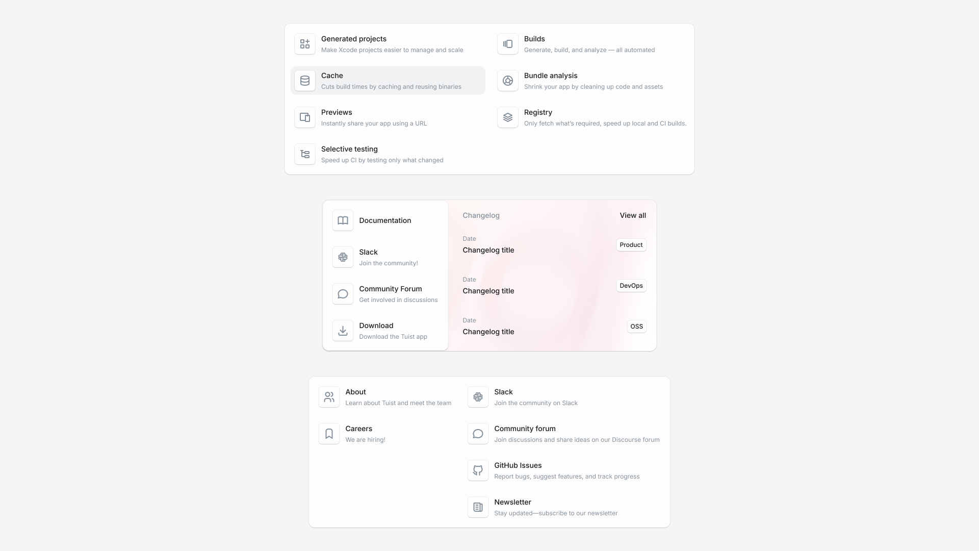
Another issue we saw was how difficult it was to understand what Tuist offered at a glance. The navigation felt fragmented and didn’t guide new visitors through the story. We decided to rebuild the site structure with clarity in mind, making it easy for developers to discover what Tuist does, explore its features, and understand how it can help their teams. Now the navigation is divided into three main parts: Features, Developers, and Resources, each designed to provide clarity on a specific aspect of Tuist.
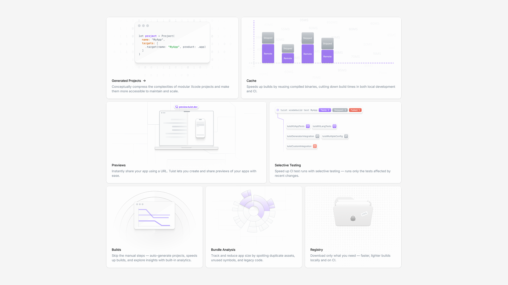
- Features highlights what Tuist offers, showcasing key capabilities and how they help teams build and scale Xcode projects efficiently.
- Developers puts the focus on the community, open-source contributions, documentation, and ways to get involved.
- Resources brings together learning materials, blog posts, and guides to help both new and experienced users make the most out of Tuist.
Stage 3: Enhancing Visual Storytelling
Our previous design made it hard to showcase Tuist’s features, especially as we kept releasing new ones. Updating the website each time felt limited due to the old design system. To make this process smoother and more engaging, we introduced bento card designs, modular sections paired with custom illustrations that explain each feature visually. This made it much easier to highlight what’s new, while also giving the page a more dynamic and consistent feel. This is my favorite part of the entire website!
Stage 4: Showcasing Customer Stories and Community Impact
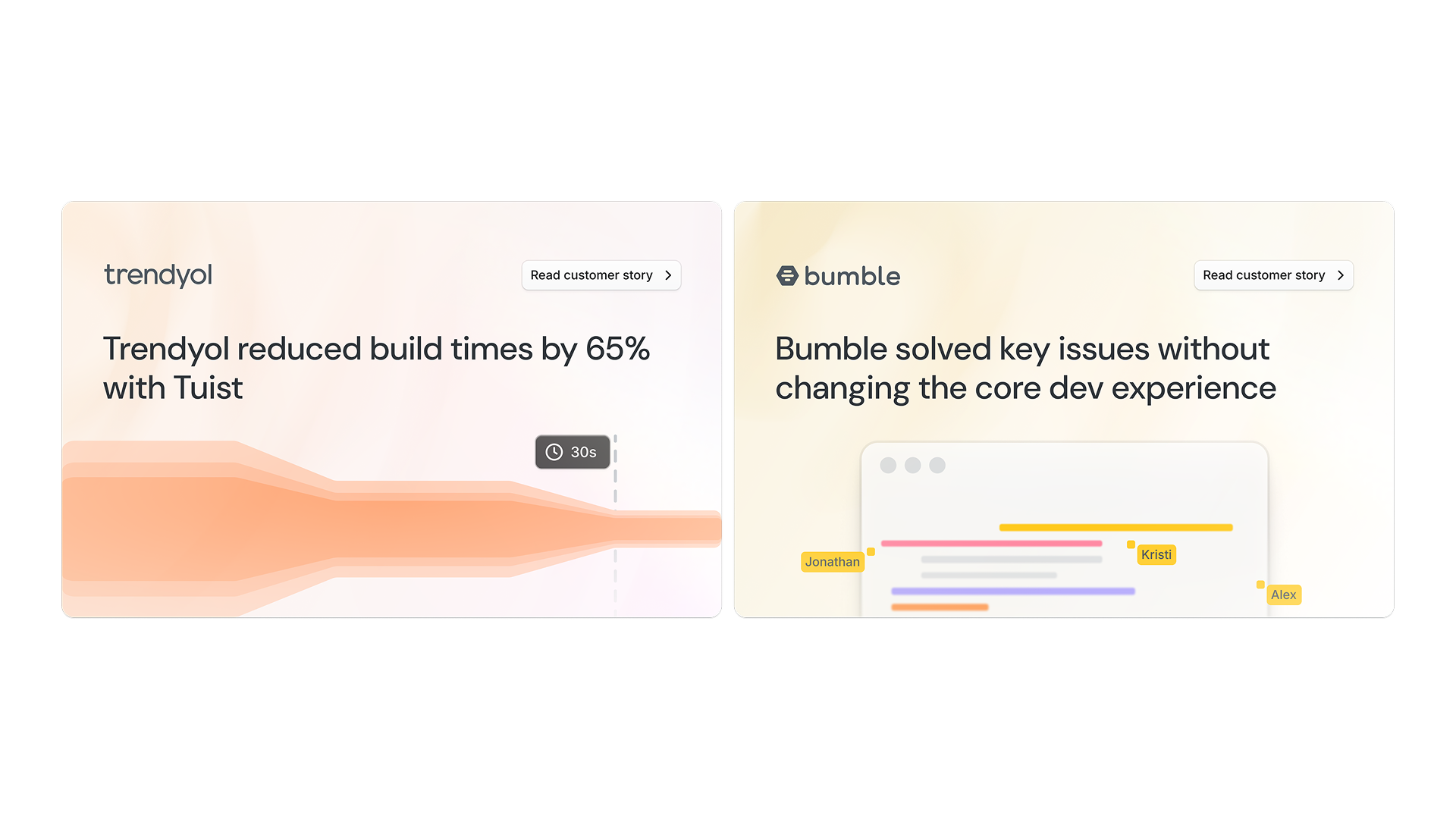
Being an open-source first company, we’ve always valued transparency and community involvement. But the old site didn’t really show how Tuist was helping teams or how contributors were shaping the project.
We added customer case studies with custom illustrations to tell real stories, how teams reduced build times, improved collaboration, and scaled their development workflows using Tuist.
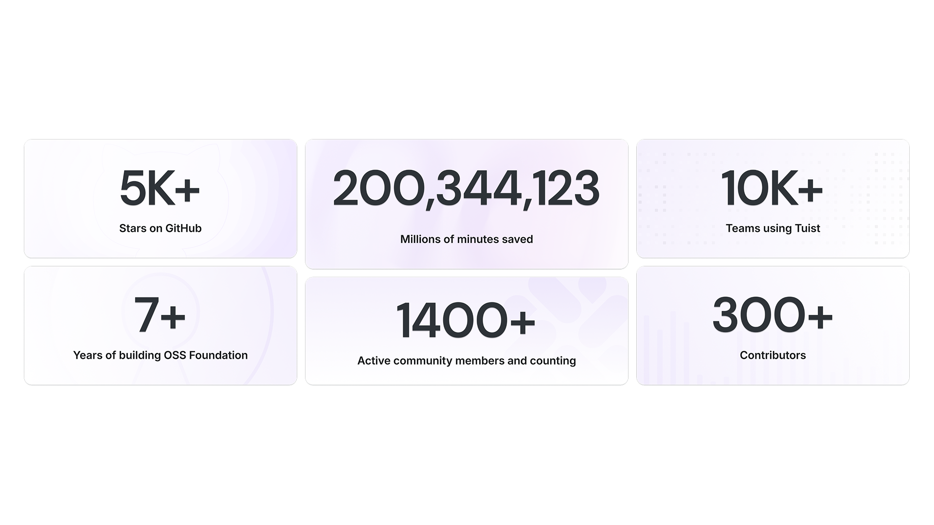
We also introduced community metrics to highlight our open-source growth and inspire more developers to contribute.
Stage 5: Unifying the Brand and Visual Language
Finally, we wanted to make sure our website felt like a natural extension of our newly redesigned dashboard. The previous site had a different tone and visual style, which made the overall experience feel disconnected. We brought everything together under a unified brand identity and built the website using the Noora Design System. All core elements, buttons, input fields, shadows, colors, and variables, are based on Noora for consistency and scalability.
While the foundation remains the same, we introduced and customized several components specifically for the website, such as blog post cards, header background visuals, and the overall gradient-driven style. You can think of it as a more stylized, marketing-focused version of Noora. Even the custom illustrations were designed using Noora’s color variables to keep everything visually cohesive.
This consistency not only strengthened how Tuist looked but also how it felt to use and explore.
Iterating on the Perfect First Impression
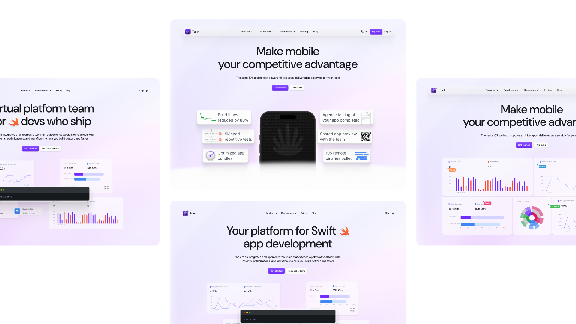
One of the biggest hurdles in the redesign was getting the header illustration just right. It plays a huge role in shaping the first impression, but representing the tool’s value in one illustration is quite challenging.
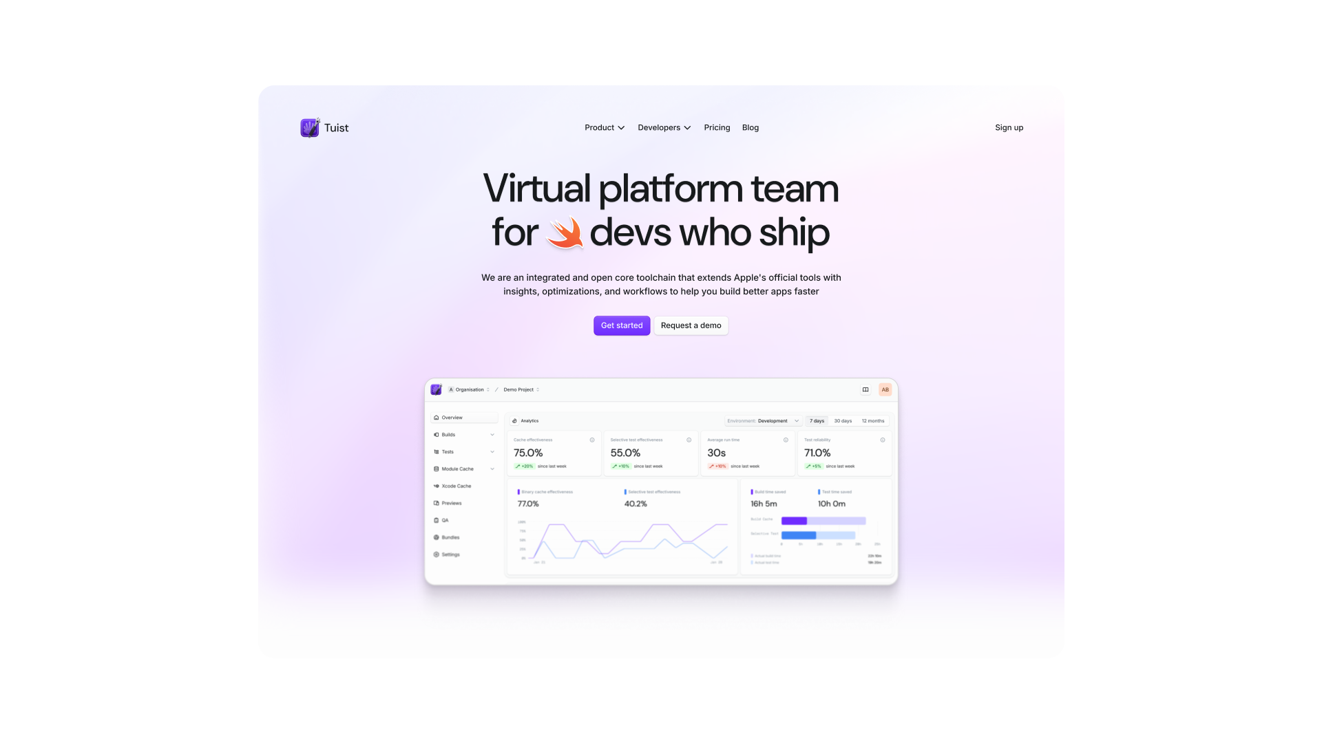
At first, we tried using a simple dashboard screenshot, but that approach quickly proved impractical. We release new features frequently, and updating the image every time would be too time-consuming. On top of that, a static dashboard screenshot doesn’t communicate much value to new users who are unfamiliar with the product.
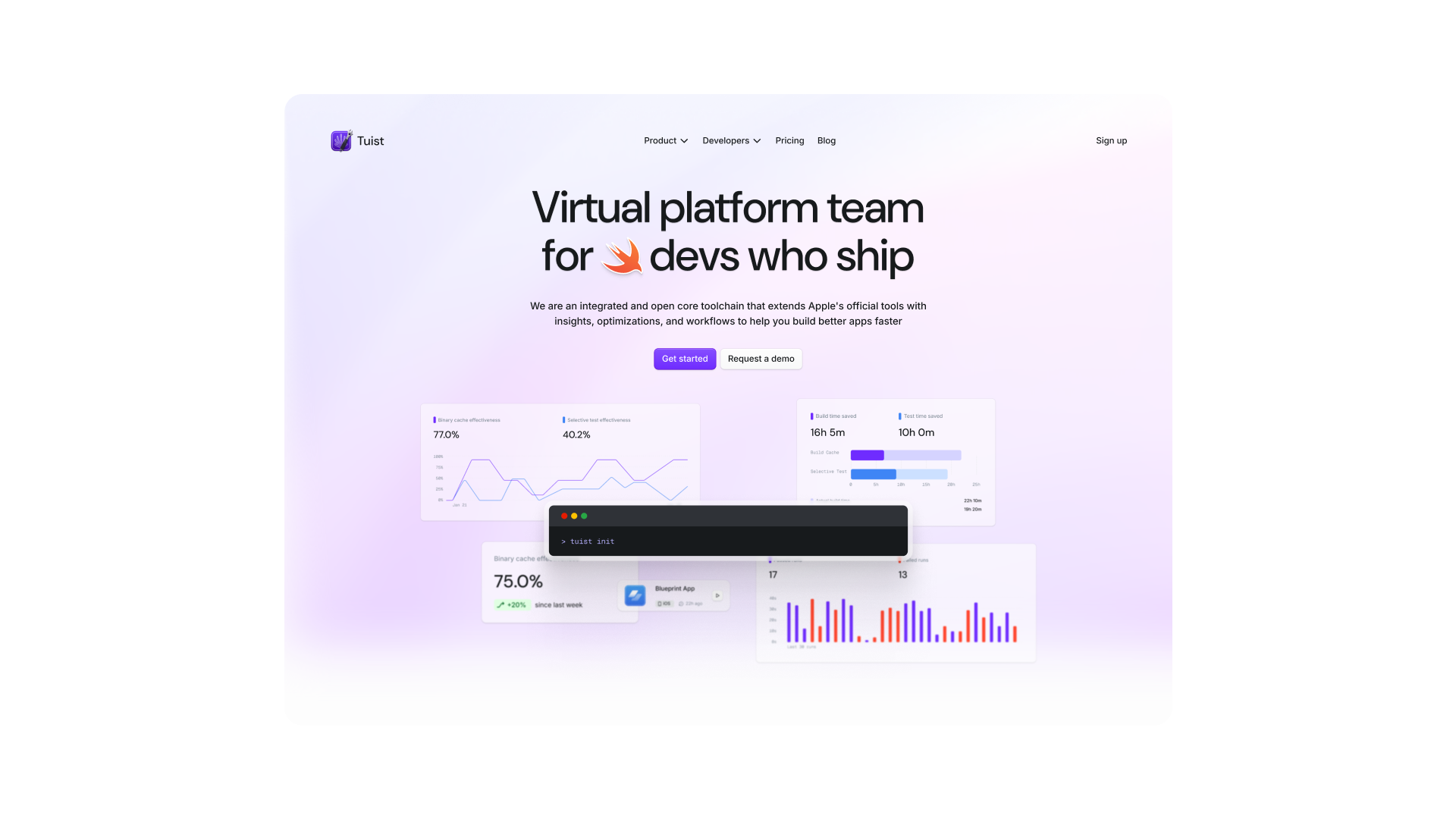
Next, we experimented with a CLI animation, but it didn’t quite fit. Tuist has grown far beyond the CLI, and focusing on it wouldn’t convey the story we wanted to tell about how fast the product is evolving.
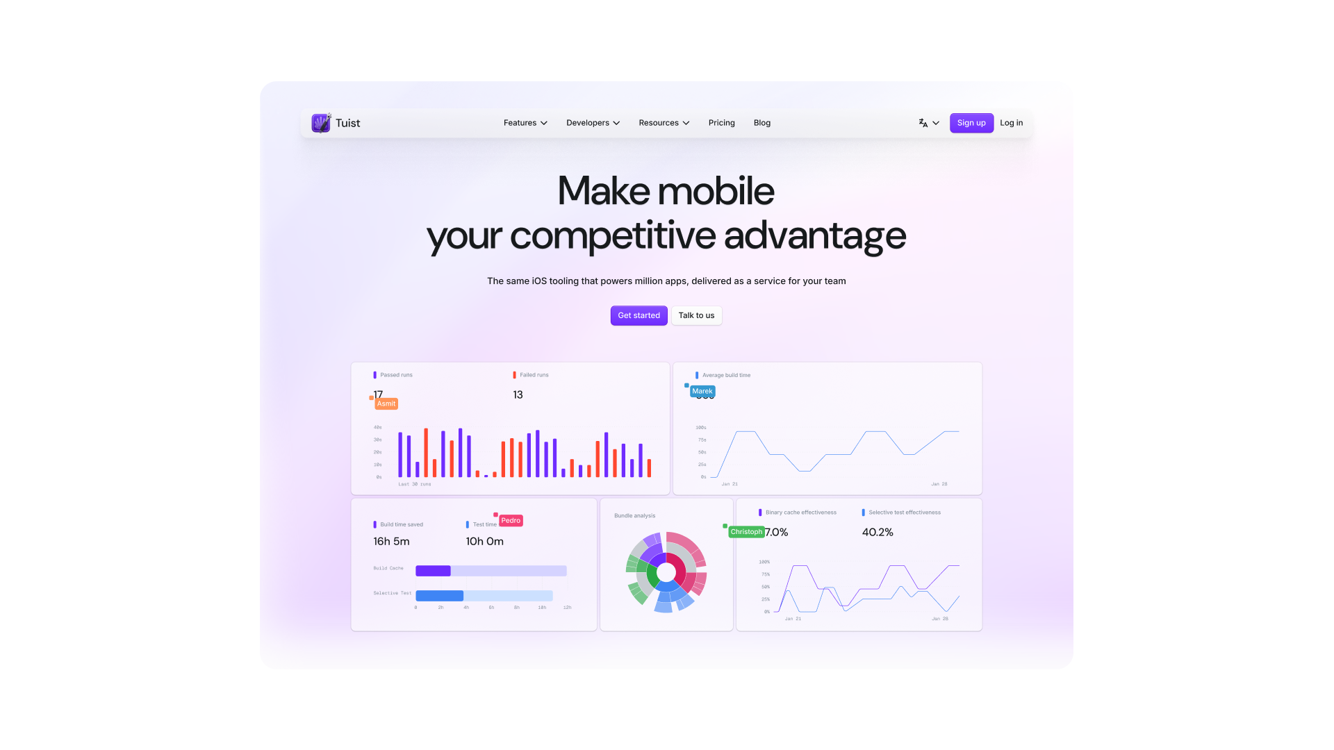
We then explored a concept featuring interactive charts and graphs, complete with animated team cursors to visualize collaboration. Although this version looked interesting in tests, we realized that random charts and metrics wouldn’t mean much to someone visiting the site for the first time.
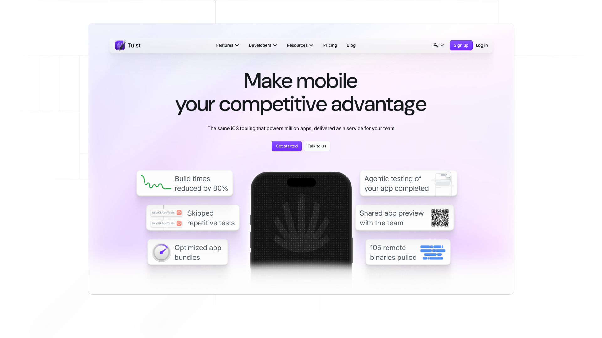
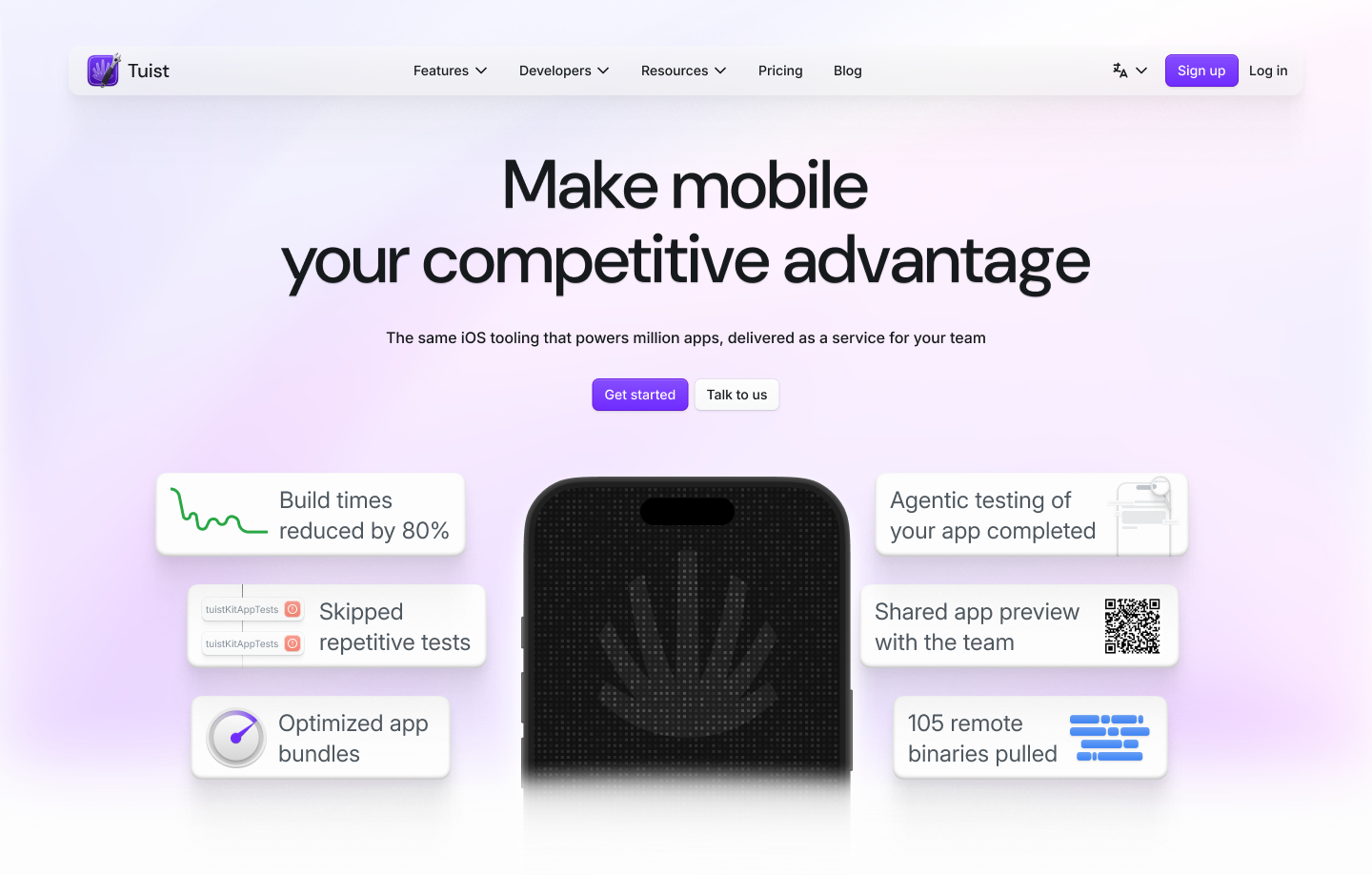
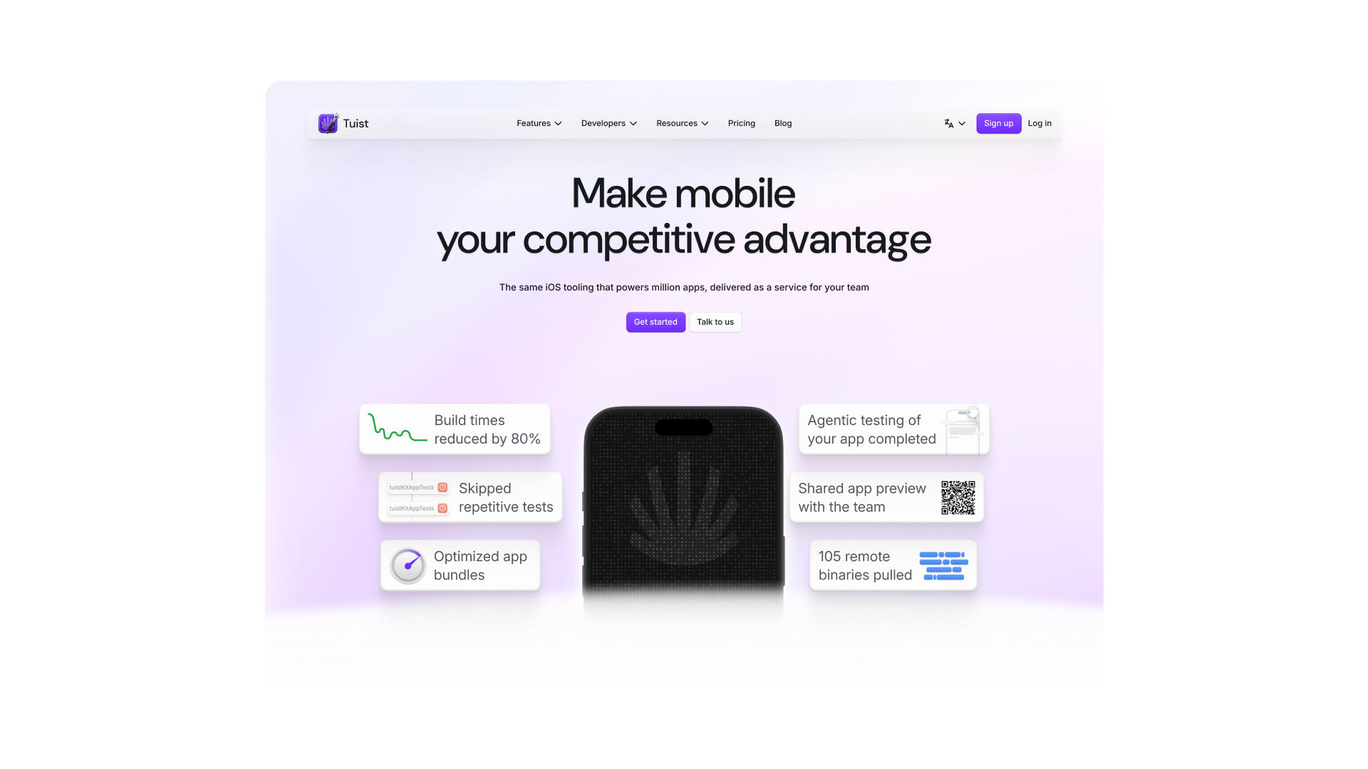
Finally, we landed on the current version, one that centers around the mobile development experience, highlighting key features we’re proud of, such as reducing build times, skipping repetitive tests, and automated QA testing. This version feels true to what Tuist is today and communicates our message clearly.
As Tuist continues to grow, we expect the header to evolve as well, after all, it’s the first impression any developer gets when they land on our page.
What’s next
Design is never truly done. It’s a constant process of refinement and exploration. While dark mode is definitely something we’ve been thinking about (and it’s on the list), our minds are already moving toward what’s next, experimenting with new visual patterns, micro-interactions, and immersive storytelling elements that make the experience feel more alive.
We see Tuist’s design language as something that will evolve with the product, adapting to how developers use it, and reflecting the balance between engineering precision and creative expression.
If we had to describe it in one line: we’re building something functional, but with soul. Redesigning and redefining Tuist’s message was and will continue being a fun and rewarding process.