When you're building software, the user interface is usually the first thing people notice. Every app or tool is built from countless hours of hard work by developers, and it's the right developer tools that make the app development process smooth and efficient. A good UI isn’t just about looking nice—it’s about creating a smooth, efficient experience that helps users get things done quickly.
And if you want to see the new dashboard in action, you can take a look at the open Tuist dashboard (yes, we use Tuist with Tuist).
Why redesign
The value Tuist brings is really important to us. While our primary platform is the CLI, we also wanted to make sure the web interface was easy to use. Although our CLI saw a major upgrade, the web interface still had room for improvement. Other developer tools like Vercel, Supabase, and Buildkite have set a high standard, and we wanted to bring that same level of quality to the app development ecosystem. Through our exploration, we identified several challenges, including:
- Enhancing the overall navigation experience
- Adapting to the product changes
- Highlighting only the most important information
The first steps
Tuist's previous dashboard was built using the Untitled UI design system. While it's a great design system overall, as projects grow, you need new components that fit within the existing framework. This can make it tricky to work with components on the design side. When I joined Tuist, my goal was to create a more accessible, scalable, and open-source design system. We named it Noora. The Noora design system will be the foundation for shaping not just our dashboard, but also our websites, marketing materials, apps, and more. To keep the community in the loop, I started a redesign initiative on our community platform, where I updated the progress of the design system every two weeks.
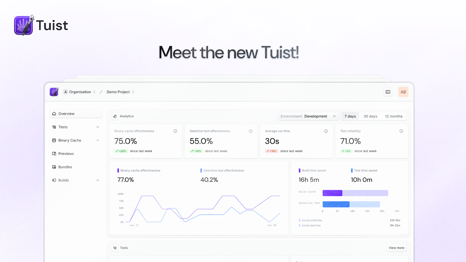
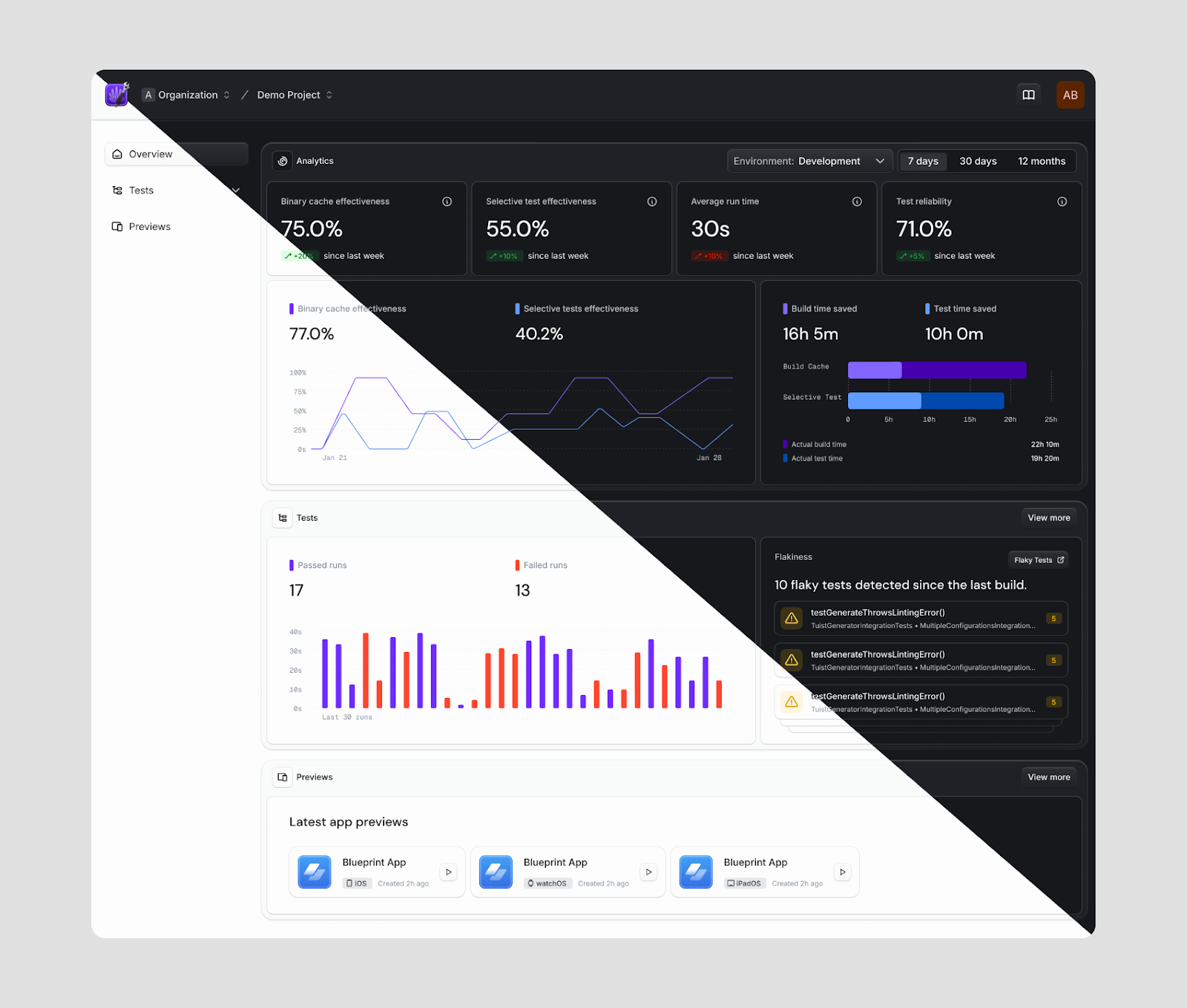
Meet the new Tuist dashboard
This redesign wasn’t just about updating the UI; our goal was to make the developer experience more intuitive. We analyzed platforms like Supabase, Appwrite, Gitpod, AppSignal, Vercel, and Buildkite to understand how to structure data and prioritize what matters most to developers. Our focus was on reducing noise and presenting only the essential information.
After multiple iterations, experimenting with multiple design directions, we finally landed on a layout that felt easy to navigate and where the content was well-structured.
What’s new
Our updated interface design is now easier to use, more intuitive, and visually appealing—because we believe great design is not just about aesthetics, but about how well it serves you.
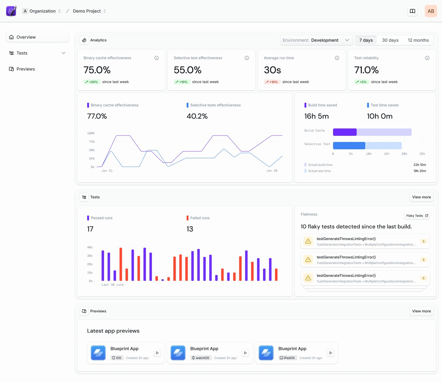
New UI
While all core functionalities remain, this new version of the dashboard introduces some exciting new capabilities—like creating organizations and projects, and inviting members directly from the dashboard. Previously, these features were available only via the CLI, but we're moving toward feature parity between the dashboard and CLI wherever it makes sense. The updated UI provides a cleaner, more modern workspace, helping you focus on what really matters: speeding up app development.
New onboarding flow
The updated onboarding flow allows you to create projects right after signing up on the web. We’ve also introduced a new accounts section where you can view your latest projects, billing details, settings, and more.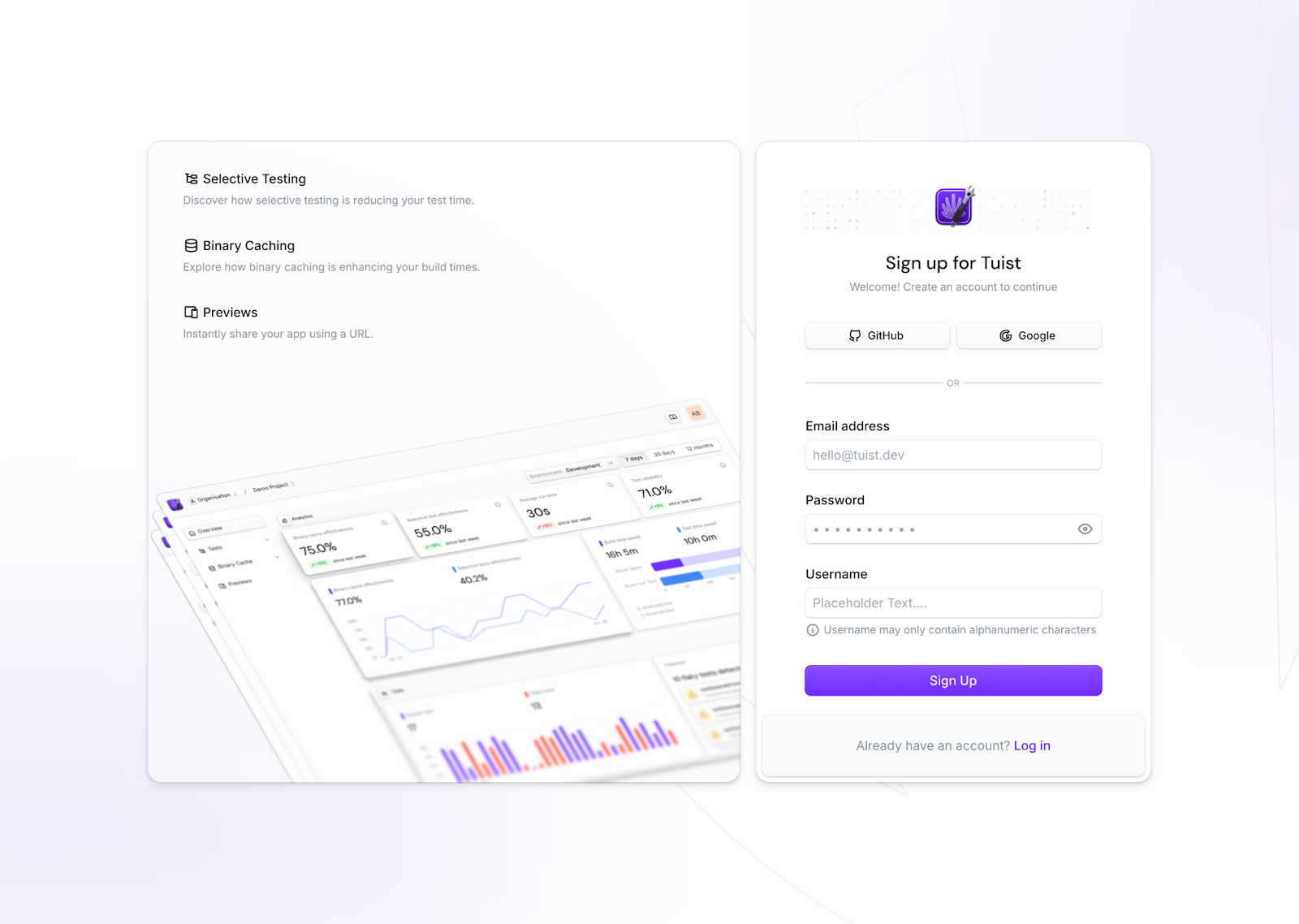
Updated color palette
We’ve chosen the OKLCH color space for our palette due to its superior accessibility, flexibility in color adjustments, and extensive color range. Unlike traditional color spaces, OKLCH aligns more closely with human perception, making it ideal for creating a visually balanced and accessible interface. For more in-depth information, check out this blog post.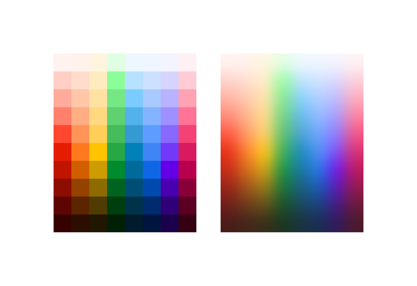
Updated components
Buttons, inputs, tables, and other UI elements have been redesigned for a sleek, consistent look, ensuring the platform not only performs well but also looks fantastic. We incorporated a skeuomorphic style with a modern twist to bring depth to our dashboard. It’s like the good old days, but better.
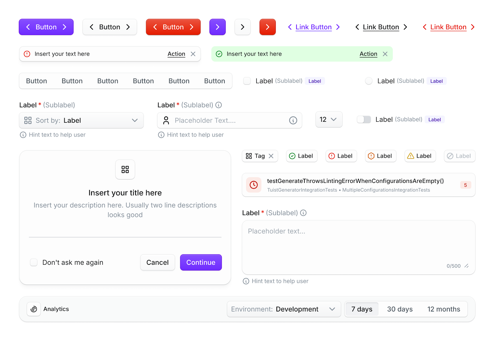
Light and dark modes
Previously, our platform only offered dark mode, but now we’ve added light mode as well. You can easily switch between light and dark modes for a more comfortable experience, anytime you like.
What’s next:
We’re just getting started—and here’s a glimpse of what’s coming:
Bring full feature parity between the CLI and dashboard: We’re working toward a seamless experience where developers can choose their preferred interface without sacrificing functionality.
Expand our design across marketing surfaces and further invest in Noora for the CLI: We want our visual identity to be consistent across every touchpoint, and we’re doubling down on Noora to bring clarity and structure to the CLI experience.
Make the design system open: We plan to share the Noora design system publicly—including the Figma file and source assets—to support and inspire other teams in the community.
Read more about our open source plans in our latest blog post — and we can't wait to see how developers use all this to create better, faster experiences for app makers everywhere.