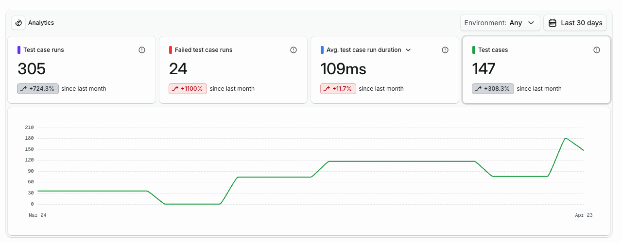
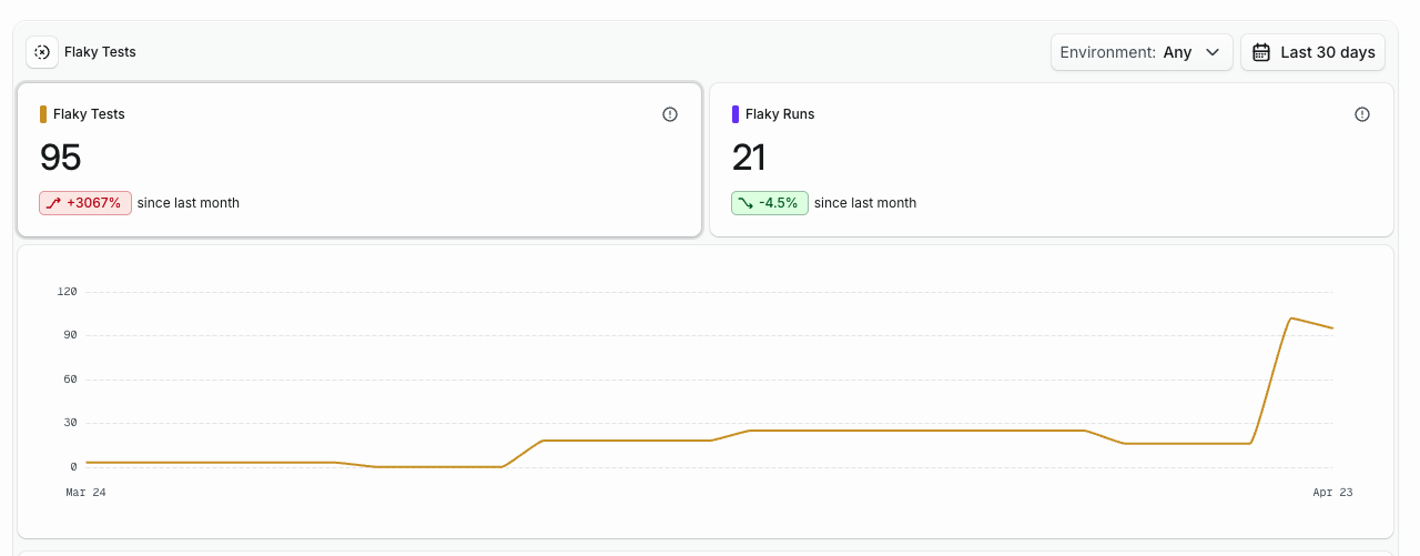
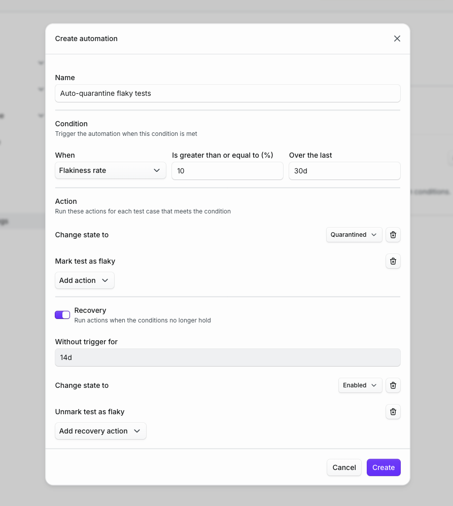
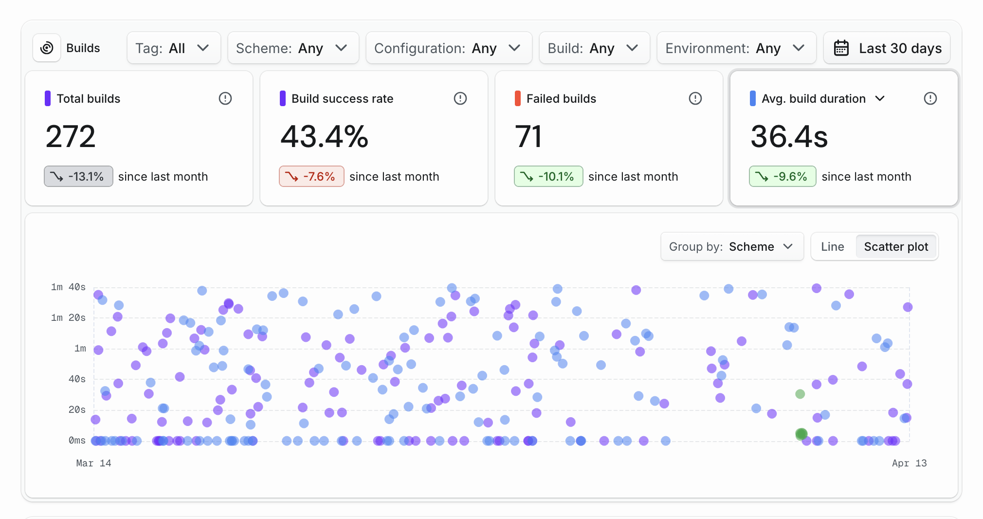
In response to recent feedback on our pricing (thanks Vijay) and to better align with our philosophy, we’ve made some updates to our pricing model.

Transitioning from Tuist Air to Tuist Pro is now simpler—just add a payment method, and you’ll only be charged for usage exceeding the defined thresholds. To make everything clearer, we’ve included a table outlining how the usage of various features is measured.

Looking ahead, we plan to provide examples, an estimation calculator, and tools to help you set usage limits, so you can stay within your budget and enjoy peace of mind.

This is the first changelog entry for the new website. We’ve redesigned the website to reflect the new direction of Tuist, and embody the new visual identity.

As part of this work we’ve also:

  • Improved the accessibility of the website.
  • Embraced structured data markup to enhance the search results.
  • Improved the pricing page to make it easier for users to understand the different plans and features.
  • Added a changelog page to keep users updated with the latest features and improvements.
  • Consolidated the dashboard and marketing pages under tuist.dev since .io domains might disappear

The design of the website has been done by Guinda Studio and it’s publicly available.

Supercharge your app development

Get started