
We're excited to share this post written by the talented team at Guinda Studio, who helped us transform our website into what it is today. They did an amazing job capturing our vision and values while creating a unique digital experience. Below, they share their perspective on the journey of redesigning the Tuist website.
Innovation through an Open Source Philosophy
Tuist challenged us to create a unique and distinctive website for their product, one that aligns with the open-source philosophy of the project and its community. This approach, championed by its creators, Pedro Piñera and Marek Fořt, promotes shared responsibility and invites contributions for continuous improvement. Moreover, they view joy as the driving force behind their product, paying attention to details with the goal of creating simple yet powerful emotional experiences. As product designers, how could we not want to contribute? Let’s dive in!
Build Better Apps Faster
Now, what exactly is Tuist? This was one of the main insights we needed to address, as it is a product for developers, thus very technical in terminology and functionalities. It had to be understandable so that anyone visiting the website could grasp its benefits and advantages before considering its adoption.
Tuist is a platform designed to enhance developers' productivity when building their products through key solutions such as Tuist Projects, Tuist Cache, Tuist Tests, and Tuist Runs.
To further scale and evolve their product, they needed to connect these functionalities with potential clients, explaining to companies what needs they addressed and what these features entailed, in order to find their tailor-made solution plan.
Ultimately, they were ready to elevate Tuist to a new level, but their website was not keeping pace with their product.
A Design that Evokes Orderly Emotions
They required a distinctive design tailored to their product’s needs, evoking emotions in an attractive and powerful manner. Emotions that were measured and orderly, guiding and explaining the entire narrative of their product and philosophy.
In a market context where all websites were homogeneous and repetitive, we had a significant opportunity to stand out.
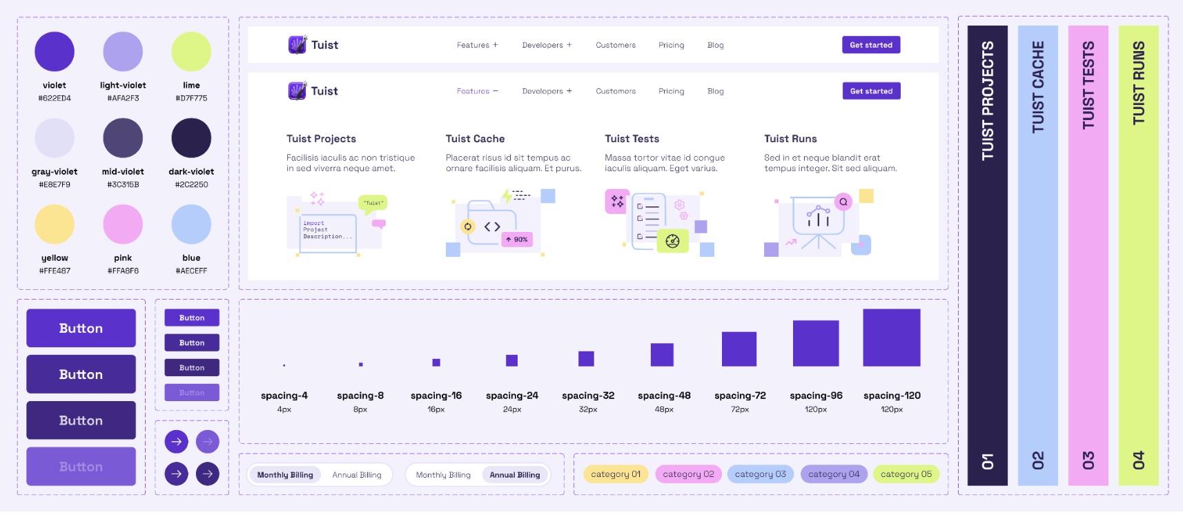
Our approach focused on two clear axes: firstly, giving a unique and distinctive personality to the Tuist brand, where a range of purples harmonized with powerful colors like lime and complementary shades, providing the dynamism and energy the brand required.
Additionally, we created unique, clear, and simple illustrations to support the more technical content.
Furthermore, we undertook exercises in visual hierarchy and storytelling to ensure all elements aligned with the product’s discourse and were on the same level.
The result was accompanied by a Design System that has allowed Tuist to continue scaling and evolving its brand universe.

Connecting the Product’s Purpose with the Brand
A brand's transformation is never-ending, just as we expect to continue seeing Tuist evolve and advance as a product. Guinda Team
Our marketing site design system is now publicly available in Figma and licensed under CC BY-SA 4.0. Feel free to use it as inspiration for your own projects!

